CLICK HERE FOR BLOGGER TEMPLATES AND MYSPACE LAYOUTS »
Showing posts with label interior design. Show all posts

Monday, February 28, 2011

2nd of March, 2011 - More Anime :D

+My Latest Artwork+

I know I didn't blog yesterday
The reason is because
I take the time to sleep the whole day.
I had Critical & Creative Thinking class
yesterday at 9am-12pm
Had an open book quiz
lucky me because I wasn't feeling really well
was coughing throughout the class period
and so after class
when I arrived home
after I've taken my shower
and ate something
I went to sleep from
3pm-8pm XD
Then after that
I continued my sleep from
9pm/10pm to 7am
weeeeeee (@w@)

So maybe some of you
may have noticed the new
added anime on the right panel.
Well yeah, I have been
introduced to a lot of anime lately
I'll just add the ones that I like the most.

------------------------------------------------

+Bakuman+
This anime tells a story of how
a high school boy became a
famous manga artist
(if I wasn't mistaken)
It is based on a true story
Here, viewers will get to see
the process of how mangas are created
what pen and pencils to use
what technique is suitable
how to do shadowing and such
but at the same time
the story has its own storyline.
This anime shows what the
anime business is all about.
It is really suitable for those
for loves to draw anime.

+Black Lagoon+
Honestly, I don't really know much
about this anime XD
But from what I can see,
this anime is about a company
called Black Lagoon.
This company is specially made
for black markets.
There are a lot of actions involved
like killing and guns.
I just love the guns part XD

+Durarara+
Again, I don't know what this anime is about.
I know there's a lot of people
watching this anime currently.
All I can see it's about a city
where a lot of
supernatural incidents happen
What I like the most
about this anime is how
everything is related.

------------------------------------------------

Aside from that,
I have a project to finish.
This time, the lecturer
told us to make something
from any recycling material.
The architecture students had to
do the same thing but with different concept.
We, the interior design student,
had to make something from the theme
"My Throne"

My Throne or Throne
here can represent something that
symbolizes power and dignity
A very common one is a throne
for a king or bishop to sit on.
Although it may sound easy,
but it is a little bit tricky
because we have to make something
by using recycling materials.

Wish me luck!
I'll be sure to share in this blog
about my project on "My Throne"

Thank You For Reading!
*bows*

Saturday, October 16, 2010

15th of October, 2010 - Rendering Techniques

ADA 101
Design Communication 1

:Chapter 4:
Rendering Techniques

This technique is a skill
on how a person can interpret
his/her surroundings into a cartridge paper
by using and mixing different types of
rendering techniques.
Sometimes it allows
a person to see a picture
in various forms.

Rendering techniques
can be divided into 20 skills.
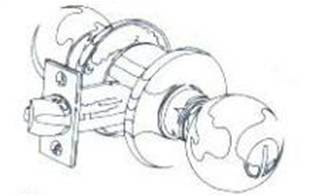
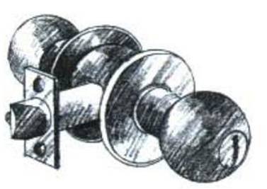
1. Two-tone contour line :

this technique separates the value

of an object into two tones.
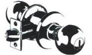

2. High contrast

The high contrast technique uses

black and white

with no intermediate tones to create forms.

All values are represented by either black or white.

3. Ten- tone contour line:

Ten different values are identified on an object,

and a closed contour line

is placed around each area.

4. Monotone:

The monotone technique requires a marker

of only one value of a colour.

By applying several coats with the same marker;

a variety of darker value can be achieved.

The darker the value desired,

the greater the number of coats which must be applied.
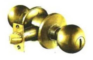

5. Monochromatic

In the monochromatic technique,

a single colour and all its value

are used to finish a rendering.

This is more effective than the monotone technique

because it produces greater value contrast.
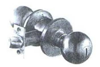

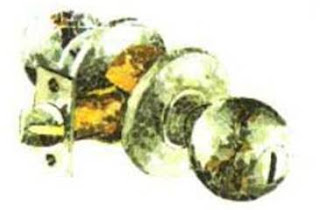
6. Photo-rendering study

The photo-rendering approach
is designed to train the artist
to see the value changes
and to record these in a rendering.

7. Collage

In general there are two types of collage.

One consists of little pieces of paper

of different colour, tones, and values

that are glued closely together to form the desired image.

The other is photo montage

in which entire forms (trees, figures, cars and etc)

are cut out and positioned.

These techniques represents

substantial investment in time, with minimal costs.

Collage is best for artwork

rather than presentation drawings for the client.

It is extremely helpful in recognizing

the many subtle changes in colour

and value that exist in any given form.
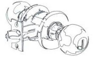

8. Continuous line

Continuous line represents

perhaps one of the most

important developmental exercises

in strengthening one’s drawing skills.

It enhances one’s ability

to draw confidently, boldly and loosely.

And it stimulates the right side of the brain.
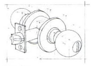

9. Construction line

Construction line technique

is used to explore and reveal the structure of a form.

This technique is a quick way

to sketch or plot a schematic design.

It is often used as an approach

to a more elaborate final drawing.
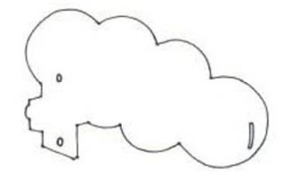

10. Positive / Negative

The positive / negative technique,

like the continuous line technique,

teaches the artist to see and reproduce objects clearly.

It forces the artist to visualize

design elements as a whole, not in parts,

by reducing the drawing

to positive space (the object)

and negative space (the page or background).

Details are eliminated and the artist is then able

to concentrate exclusively on the form and its proportion.
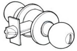

11. Punch line

The punch line is also known as the profile line.

It is a series of line weights

used to accentuate targeted forms.

Punch lines add emphasis to elements in the drawing

and bring them forward.

They differentiate the various elements

and give the appearance of depth.

This technique is suitable for quick sketches in pencil

or felt-tip pen or for high-quality drawing in pen and ink.
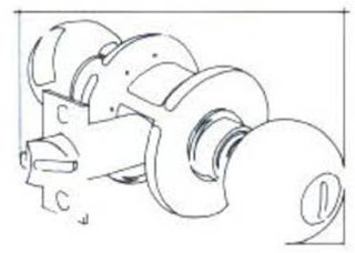

12. Border composition

This technique focuses on the outline of forms

within the drawing and their relationship

to each other and to the edge of the page.

No values are represented;

instead, line (usually a closed contour line) is used

to edges of the object off the edge of the page.

This technique can enhance a line drawing

and turn an otherwise marginal work

into a successful rendering.
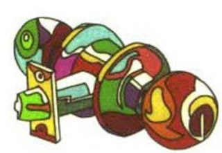

13. Abstract illustration

Abstract illustration is used in graphics arts

but never as presentation drawing.

Closely related to the contour line technique,

abstract combines closed contours

with areas of solid colour.
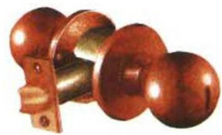

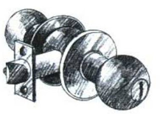
14. Tone value

Tone value technique

uses value instead of line to delineate forms.

It is considered to be the most lifelike technique,

representing things as we actually see them.

It is based on a solid understanding of light

and its characteristics, including shade and shadow.

Tone value drawings are usually highly prized

as a final presentation graphic for the client.

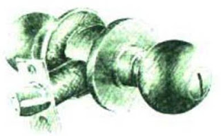
15. Line value

Line value drawings are renderings in line.

It is used extensively by the architectural professions

as it is fast and can make

the product extremely appealing to clients.

It is especially recommended for

preliminary presentations and quick studies,

although in a refined form

it is very suitable for final graphics.

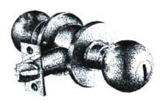
16. Tone / line value combined

Combining tone and line value drawings

offers the greatest flexibility

and is preferred by many professionals.

It incorporates the best qualities of each

and can be used with variety of techniques.

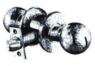
17. Pointillism

Pointillism, or “stippling”,

means rendering value changes with dots.

This technique though somewhat time consuming,

can give the drawing a very soft

and refined appearance.

It is most appropriate for black and white reproduction,

although by using coloured inks or pens

a coloured drawing can be produced.

18. Vertical / Horizontal line

Vertical and horizontal line technique

create form and value with parallel lines.

As in pointillism,

shapes are identified through value changes

rather than outline.

Both vertical and horizontal line techniques,

which use pen and ink most often,

are very time consuming,

but allow for interesting results,

particularly when viewed from a distance.
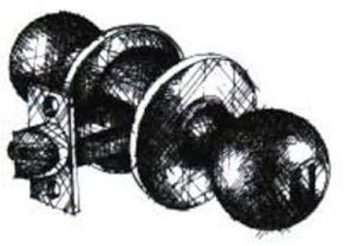

19. Cross hatching

Cross hatching uses crossed lines

to identify value changes and forms.

Pencil or pen and ink are the most appropriate mediums.

While cross hatching is extremely time consuming,

it can result in a superb final presentation drawing.

20. Computer application

Computer graphics has become very popular in recent years.

Although it takes time to master,

the results can be very impressive.

Computer application in graphics

has both advantages and disadvantages.

The advantages include allowing artists

to manipulate their work without fear of ruining the original,

to print graphics with smooth, crisp lines and edges,

and to experiment with colour quickly and easily.

Computer aided design programs

allow one to view the space in three dimensions

and to see the design in a walk-through

sequence of the spaces.

Once all possible views are examined,

one may choose the angle most suitable

to the final rendering.

The disadvantage of the computer is that

the artist is almost automatically

out into the left-side mode of the brain,

and working on two-dimensional computer screen

can inhibit creativity

and the looseness needed for impulsive,

imaginative renderings.

However, the computer is an important and useful tool,

especially for some of the time consuming tasks.

Its use should be combined with

personal creativity and application

of the design principles.


-------------------------------------------------------

So as for practice
we were told to draw two stones
by using rendering techniques
that we learned.
Somehow I can't show it here
because my scanner
is still not functioning.
When I showed the drawing
to my lecturer, he told me
"you need to work on your contrast"
I was like "Huh? Why?"
and he said "because it looks flat"
hahahahahahhahaha XD

Then I edited the drawing a little bit
to give it it's shape and showed it again.
This time he said "Yes! But it still need some contrast"
I was like "Oh yeah~"
hahahahahahha

So as for our assignment
we had to draw 2 stones again
but on an A2 cartridge paper
which is like damn big!
I just finished the scaling
and rough picture of it.
Hopefully I can finish with
the hatching and contrast on time
(@_@)

Thank You For The Visit!
*bows*

Thursday, October 14, 2010

Yesterday's Class: Chapter 2 - History & Philosophy of Design

Gomenasai *sobs*
I was suppose to post this last night
but last night the Internet was being a bitch.
It seems that every night there's no internet.
A friend of mine also told me that she
doesn't have internet every night.
I am soooo going to complain
at the Digi Centre
if this goes on.

Okay so yesterday was
Visual Communication in Design class.
We learned Chapter 2 yesterday
which was History & Philosophy of Design.
This chapter mainly talks about
how visual communication development
from prehistoric period to today.

There are four topics in this chapter:
1. History of Visual
2. Theoretical Overview
3. Gestalt Principles
4. Gestalt Application

What interest me the most
was the 21 Century Movement
which is a subtopic of History of Visual.
In this subtopic,
it introduce us about a lot of things.

For example:
:Cubism:
French art critic Louis Vauxcelles
first used the term "cubism",
or "bizarre cubiques",
in 1908 after seeing a picture by Braque.
He described it as "full of little cubes",
after which the term quickly gained wide use
although the two creators did not initially adopt it.
Art historian Ernst Gombrich
described cubism as
"the most radical attempt to stamp out ambiguity
and to enforce one reading
of the picture—that of a man-made construction,
a coloured canvas."
+Click here to read more about it+


:Dadaism:
According to its proponents,
Dada was not art,
it was "anti-art".
Everything for which art stood,
Dada represented the opposite.
Where art was concerned with traditional aesthetics,
Dada ignored aesthetics.
If art was to appeal to sensibilities,
Dada was intended to offend.
Through their rejection of
traditional culture and aesthetics,
the Dadaists hoped
to destroy traditional culture and aesthetics.
But to me I think that dadaism
is something like collage
where you cut and paste pictures.
+Click here to read more about it+


:Expressionism:
A cultural movement,
initially in poetry and painting,
originating in Germany at the start of the 20th century.
Its typical trait is to present the world
under an utterly subjective perspective,
violently distorting it to obtain an emotional effect
and vividly transmit personal moods and ideas.
Expressionist artists sought to express
the meaning of "being alive"and
emotional experience rather than physical reality
+Click here to read more about it+


There are more actually
such as futurism, surrealism,
photography and the modern movement.
It was really interesting but
some of it were hard to understand
because in our class we don't have
a whiteboard NOR a LCD!!
Lots of people have been complaining
including myself DX

I would prefer the lecturers
use whiteboards because
when explaining art,
you can't just show pictures and craps
you'll also have to show some movement
of how the art works.
I sympathize the lecturers
because some of them have trouble
teaching Mathematics
(I heard)

You know if they held a debate
competition regarding this matter
I would sooooo enter and win it!
harharhar
...sigh...
now I remember the time
when I was a debater
...damn...


That's All For Now :D
Thanks For Staying!
*bows*

Wednesday, October 6, 2010

Today's Class: Chapter 1 - Principle of Visual Communication

ADD 105
Visual Communication in Design

Date:
6th of October, 2010

Today's class teaches us
about the first chapter in
Visual Communication in Design
which is Chapter 1
Principle of Visual Communication.

There are four topics in this chapter:
1. What is Visual Communication
2. Visual Hierarchy
3. Principle of Visual Communication
4. Design Organization

Of course I won't be going through
everything with you all
because that would seem
really boring and it would be
really really long.
So I will just tell you
what caught my interest.

Actually all the topics caught my interest
but what made me focus more
was topic number 2
Visual Hierarchy

Visual Hierarchy is used in design
to help the viewer process information.
Visual Hierarchy is the order or sequence
that most people will see and identify objects
(first, second, third, fourth, etc)
People focus their eye's on things
that stand out, such as a bright red stop sign, first.
Later they look at things that are smaller
or less noticeable, such as the leaves on the sidewalk.
Objects the eye sees first and the mind perceives
are considered to be high on the visual hierarchy

What it actually mean is that
the top most of the
visual hierarchy
is what we see first.
Such as the front cover of our text book
the first thing that we'll notice is the picture on
the second thing is the big title on the text book
the third (also the last) is the small letters.
That is how the human mind works
where we're more interested in images
and something that strikes out.

Another example is
when you visit my blog :D
the first thing you'll notice is
the humongous edited picture (by me)
that says 'Irasshaimase to Francess' blog'
Then as you scroll down
you'll read the content of my blog
which is at the left side of this blog
where I post my blogs and stuff.
Next you'll notice the right side of my blog
where I put information about myself.
This is what the note meant by
" Visual Hierarchy is the order or sequence
that most people will see and identify objects "

If you still don't understand
then I shall put it in the simplest way I can.
Visual Hierarchy is something like
observing something from afar
and slowly you observe it closer and closer
until you reach the point where you can't get any closer
which of course you only need your eyes in this experiment.

So that's all for now :D

Domo Arigato-gozaimasu
*bows*

Speaking Virtual Anime Character


+source+

I was checking for some anime widget
when I found this cute anime guy!
He'll talk if you click him
and follows you around.
It's really adorable
I'm sure the ladies would love it.

I would love to add him in my blog
but my blog theme won't allow it
because the theme for my blog
is black & pink
and the anime widget is
...blue...
damn! hahahaha

There's nothing much to say actually XD
since it's only like 6.30am right now
I have class today at 2pm-4pm
ADD 105 Virtual Communication in Design
maybe I'll have something by then
hahahaha

Thank You As Always!
*bows*

Sunday, October 3, 2010

Insomnia

Okay so this thing is not really new to me
I have this since I was 14 years old
and now it seems that it coming to me
more and more often
since I started college.
I don't take coffee if you all are wondering
because it's not good for my health.
I don't take those energy bars
because it's hard to find those here.

Insomnia is a common condition
in which a person has trouble falling or staying asleep.
This condition can range from mild to severe,
depending on how often it occurs and for how long.
Insomnia can be chronic (ongoing) or acute (short-term).
Chronic insomnia means having symptoms
at least 3 nights a week for more than a month.
Acute insomnia lasts for less time.
Some people who have insomnia may have trouble falling asleep.
Other people may fall asleep easily but wake up too soon.
Others may have trouble with both falling asleep and staying asleep.
As a result, insomnia may cause one to get too little sleep
or have poor-quality sleep.
One may not feel refreshed when one wake up.

:1st SOURCE:
:2nd SOURCE:

This matter shouldn't be taken lightly
when it gets chronic.
I have a comorbid insomnia
which is not a really serious one.
I hope this information will be of use
since I barely have the energy to think.

Thanks For Reading!
*bows*

Saturday, September 25, 2010

Legend Of The Guardians: The Owls Of Ga'hoole


25th of September 2010

I went to Centre Point today
to meet a friend of mine,
Rona Clarenie,
from my former high school.
So we went to watch
Legend Of The Guardians: The Owls Of Ga'hoole
Basically this movie is about Owls.
It's a very predictable fantasy movie where
there's the Guardians and the Pure Ones
The Guardians are the good owls while
the Pure Ones are the bad owls.
The bad owls plans to defeat the good owls
and then bla bla bla
the good owls wins in the end.
hahahahahahahaha

Eventhough the storyline is predictable
the graphics are amazing.
I don't know how many people realized it
but the way they do the graphics are just wow.
Throughout the movie
all I did was thinking
'how did they do that?'
'what software did they use?'
'I wanna do something like that too'
and I was also focusing on the angles and such.

Nothing much today
-The End-
*laughs*

Thank You For The Visit!
*bows*