CLICK HERE FOR BLOGGER TEMPLATES AND MYSPACE LAYOUTS »
Showing posts with label design communication. Show all posts

Saturday, December 11, 2010

10th of December, 2010 - The Usual [Class + Assignment]

It would be nice to be studying in such environment :3

dum dum dum
It's Friday! (@w@)
and it's almost the end of the year!
somehow I just can't feel
the difference

ADA 101
Design Communication 1

hahahhahahaa XD
okay so today was Design Com class
and we learned about drawing systems.
It was also the last chapter of our class
but it doesn't mean we don't have
to go to class after this.
In the topic,
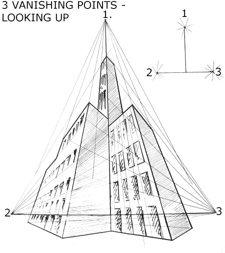
we learned about perspective.

Perspective projection
portrays 3D form or
construction by projecting
all of its points to a picture plane
by straight lines that converge at
a fixed point representing a single
eye of the observer (station point).

There are three types
of perspective:

1. One-Point Perspective
One horizontal axis is perpendicular
to the picture plane, the other horizontal
axis and the vertical axis are parallel with
the picture plane.

2. Two-Point Perspective
Both horizontal axis is perpendicular to
the picture plane, and the vertical axis
remains parallel with the picture plane.

3. Three-Point Perspective
Both horizontal axes as well as
the vertical axis are oblique to the
picture plane.

---------------------------------------------

So I hand in the colour assignment
and also the abstract assignment
which was also previously rejected
along with the colour assignment.

As you can see in the progression
the right side of the painting
is changed frequently
because the lecturer wasn't
really satisfy with it XD hahaha
If you haven't notice
this type of art is called
surrealism
It is an art where the artist
make a dreamy sort of artwork.

At first I didn't really realize
that I was doing a surrealism
until the lecturer commented it.
There I was like "Oh ya kan!"
hahahahahhaa XD

So there's 2 more
assignments to go
and 3 more final project
to do XD harharharhar

Thank You For Reading!
*bows*

Friday, December 3, 2010

3rd of December, 2010 - My Mum's Doggies + Assignment [Balance]

+my mum with the doggies+
[Happened few days ago]

Yeah we have a lot of dogs
waiting outside of the house
for my mum to give them some
chicken heads XD
This is only the ones in front
of our current house.
There's another group of dogs
waiting for my mum
at the new house
in our village.
So...we have about
more than 10 dogs now?
hahahahahahaha

I guess it can't be helped
since my mum likes to spoil
dogs by giving them chicken heads.
We also have cats in our house :D
4 cats and 4 kittens XD
The kittens are so so so cute!!!
I don't want to give them away!
Weeeeeeee (@w@)

A beautiful picture
that was taken randomly

outside of my house

-----------------------------------------

Aside from that
I spent the whole night
finishing my assignment
regarding 'Balance'

When it comes to design,
Balances means visual weight equilibrium.
Like how much value you should put
to make the drawing or design
balance in a manner.
Sorry but it's really hard
to find good and suitable pictures
to explain about Balance.
So I'll just leave it
to you guys to
do the searching.

ADA 101
Design Communication 1

This is my work:
Assignment = Abstract + Balance

It's better than what I expected
because I thought that I want to
do this thing all over again
but then I looked back at this drawing
and thought that it's really nice
and that I want to put
some colours on it.
And tadaa~! :D

I used water colours,
poster colours, ballpen, and a 6B pencil
Sketches took about 4-6 hours
and colouring took about 3-4 hours
then the finishing touch
took about 2-3 hours.

This is what will happen
if I solely and wholly use
the dining table to do my assignment.
My mum said it's better if I take
this table to my room at the new house
since I really need a big table
to do my assignments.
And usually I don't
really tidy up the table XD
hahahahahha

Thank You For The Visit!
Hope You Enjoyed Your Stay!
*bows*

Friday, November 19, 2010

18th of November, 2010 [Part 2] - Design Communication 1 Assignment

ADA 101
Design Communication 1

So again, I spent 8 hours or more
to do my Design Com assignment.
Which means I just finished
2 assignments in 1 day!
woohoo!!!

So here's the assignment
We had to draw our college
a.k.a. Cosmopoint I.C.T. Kota Kinabalu

Here's the original picture
and as you can see
it doesn't really match
because frankly I'm not good
in drawing buildings (>w>)
which is really a weakness of mine
but I still try :D and try :D

I did mentioned about the drawing
that was a fail in my previous post
and yeah I was so frustrated
at that moment.
But in the end
I MADE IT!!!
WOHOO!

So again nothing much
except that I did my assignments
the whole day.
Anyhow,
I'll be sure to share
something useful next time XD
Until then
bubye~

Thank You For The Visit!
*bows*

Monday, November 1, 2010

1st of November, 2010 - How To Draw Water & It's Reflection


ADA 101
Design Communication I

First of all
IT'S NOVEMBER!!!!!
Another month and 29 days
and it will be 2011!
...Wow...

Anyhow
I know most people
find it difficult to draw or sketch
water and reflections
including me as well.

The last 2 weeks
we were taught on how
to draw water & reflections
+Click Any Photo To Enlarge It+

I didn't really get it at first
but I tried to understand
by looking at the pictures given

+1st photo+

+2nd photo+

As what is shown above
when drawing a view
the water seems to be reflecting
anything above the eye level

Although we can indicate that
the eye level is the straight line
that we see on the photo
but actually it's NOT
The eye level is slightly
above the 'line'
which is why there's a missing
hill on the water's reflection
in the 1st photo.

Same goes to
when you're sketching a
short-distance view

You can see the reflections on the water
in these artworks.

:IMPORTANT:
However, do remember that
the water has to be drawn
flat and still when it
comes to drawing reflections.

-----------------------------------------------

I haven't really tried to apply
this technique in my drawings yet.
If I do, I'll surely show it in my blog.

For those taking Design Communication I
and those who are going to take this subject
this is a good place for you to
refresh, learn and understand
before taking the subject.
For those who are taking it now
(which is mostly my classmates)
STUDY NOW!!!
Peace :D

Thank You For Reading!
I Hope I Was Of Help!
*bows*

Saturday, October 30, 2010

29th of October, 2010 - Holding The Pencil [Sketching & Drawing]

ADA 101
Design Communication 1

It's a Friday today and supposedly
I have 2 classes today.
However, since Sir Raed is a
flying lecturer until he finds a new one,
so our classes with him will keep on changing.

Today in Design Communication class
we were on Chapter 6-Sketching & Drawing.
So I'll be only sharing a little bit of what
we learned today, which is 'holding the pencil'

There are 4 ways to hold a pencil
when it comes to sketching & drawing.

1. Basic Tripod Grip
This is the basic grip that we normally
used since we were in kindergarden
usually for writing like when
you're doing your essay.

It is where you use your
thumb, forefinger and middle finger
to form a tripod or triangle for the grip.
Your ring finger and pinky finger supports
you to write or sketch.
Normally used when you want to make
fine details on you sketches.

2. Extended Tripod Grip
This is almost the same as the
basic tripod grip, only that
your grip moves further up
and this grip is usually loose.
Normally used when you want to
make a long line or curve.

3. Overhand Grip

Most artists will prefer to use this grip
because it is suitable to produce flowing
and sweeping lines and also
when you want to do sketching,
hatching, cross-hatching, and value work

Another reason is because this grip
does not need a propped arm
and it is only limited to you arm span.

4. Underhand Grip
This grip is normally used for
casual and broad sketching
and it is a very loose
and relaxing grip.

It is basically like a tipped-over
tripod grip but you can move the thumb
higher or let the pencil sit in a 'V'
at the thumb and palm with
the ring and middle finger
lightly controlling the tip.

----------------------------------------------

Our lesson was quite short and quick
since there was only a little information given.
The rest of the time that we had we used it to
do our final touches to the assignment
that we were supposed to pass up
since Sir Kennedy said it wasn't enough
so might as well do a little bit of changes
to get extra marks :D hahahahaha

The lecturer also showed us
a few examples on how to
properly use the poster colour
and what a punch line is XD
and also a few more stuff

weeeeeeeee (@_@)

Thanks For Reading!
*bows*

Sunday, October 17, 2010

16th of October, 2010 - The Stones?

+16th of October 2010+
[Photo]


Remember about the last post
where I shared about rendering techniques?
and that we were told to do a sketch [assignment]
and use the technique?

Well here are the sketches :D
Although I just took a picture of it
but it has nice effects!
Tell me what you think XD


So during Design Communication 1 class
we were asked to practice first.
So this was the result
where I we were told to draw
on our A4 sketch book.

P.S.
we had to look for 2 stones
for our sketch XD

Then next I have to
draw the stones on an A2 cartridge paper
which is seriously like 4x larger than an A4
(OwO)

Here's a closer view

I'm still not satisfied
with the results
I think I'll make a few more adjustments
(since it took me hours to sketch the stones)

That's all for now XD

+Theodore Ramli+
a.k.a. my brother


Visit His Band Facebook Page!
:Befalls The Argosy:

Thank You For The Visit!
*bows*

Saturday, October 16, 2010

15th of October, 2010 - Rendering Techniques

ADA 101
Design Communication 1

:Chapter 4:
Rendering Techniques

This technique is a skill
on how a person can interpret
his/her surroundings into a cartridge paper
by using and mixing different types of
rendering techniques.
Sometimes it allows
a person to see a picture
in various forms.

Rendering techniques
can be divided into 20 skills.
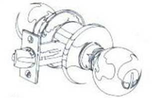
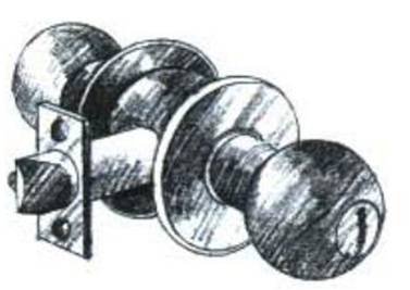
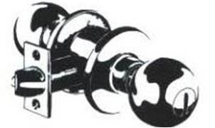
1. Two-tone contour line :

this technique separates the value

of an object into two tones.

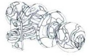
2. High contrast

The high contrast technique uses

black and white

with no intermediate tones to create forms.

All values are represented by either black or white.

3. Ten- tone contour line:

Ten different values are identified on an object,

and a closed contour line

is placed around each area.

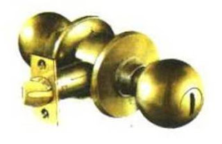
4. Monotone:

The monotone technique requires a marker

of only one value of a colour.

By applying several coats with the same marker;

a variety of darker value can be achieved.

The darker the value desired,

the greater the number of coats which must be applied.

5. Monochromatic

In the monochromatic technique,

a single colour and all its value

are used to finish a rendering.

This is more effective than the monotone technique

because it produces greater value contrast.
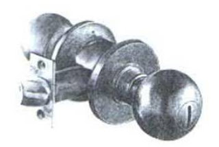

6. Photo-rendering study

The photo-rendering approach
is designed to train the artist
to see the value changes
and to record these in a rendering.
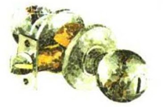

7. Collage

In general there are two types of collage.

One consists of little pieces of paper

of different colour, tones, and values

that are glued closely together to form the desired image.

The other is photo montage

in which entire forms (trees, figures, cars and etc)

are cut out and positioned.

These techniques represents

substantial investment in time, with minimal costs.

Collage is best for artwork

rather than presentation drawings for the client.

It is extremely helpful in recognizing

the many subtle changes in colour

and value that exist in any given form.
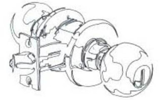

8. Continuous line

Continuous line represents

perhaps one of the most

important developmental exercises

in strengthening one’s drawing skills.

It enhances one’s ability

to draw confidently, boldly and loosely.

And it stimulates the right side of the brain.
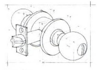

9. Construction line

Construction line technique

is used to explore and reveal the structure of a form.

This technique is a quick way

to sketch or plot a schematic design.

It is often used as an approach

to a more elaborate final drawing.
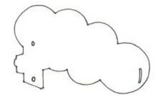

10. Positive / Negative

The positive / negative technique,

like the continuous line technique,

teaches the artist to see and reproduce objects clearly.

It forces the artist to visualize

design elements as a whole, not in parts,

by reducing the drawing

to positive space (the object)

and negative space (the page or background).

Details are eliminated and the artist is then able

to concentrate exclusively on the form and its proportion.
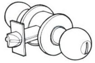

11. Punch line

The punch line is also known as the profile line.

It is a series of line weights

used to accentuate targeted forms.

Punch lines add emphasis to elements in the drawing

and bring them forward.

They differentiate the various elements

and give the appearance of depth.

This technique is suitable for quick sketches in pencil

or felt-tip pen or for high-quality drawing in pen and ink.
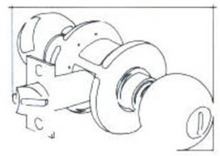

12. Border composition

This technique focuses on the outline of forms

within the drawing and their relationship

to each other and to the edge of the page.

No values are represented;

instead, line (usually a closed contour line) is used

to edges of the object off the edge of the page.

This technique can enhance a line drawing

and turn an otherwise marginal work

into a successful rendering.
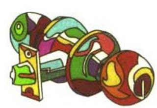

13. Abstract illustration

Abstract illustration is used in graphics arts

but never as presentation drawing.

Closely related to the contour line technique,

abstract combines closed contours

with areas of solid colour.
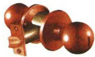

14. Tone value

Tone value technique

uses value instead of line to delineate forms.

It is considered to be the most lifelike technique,

representing things as we actually see them.

It is based on a solid understanding of light

and its characteristics, including shade and shadow.

Tone value drawings are usually highly prized

as a final presentation graphic for the client.
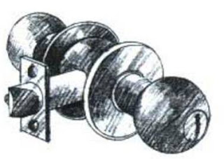

15. Line value

Line value drawings are renderings in line.

It is used extensively by the architectural professions

as it is fast and can make

the product extremely appealing to clients.

It is especially recommended for

preliminary presentations and quick studies,

although in a refined form

it is very suitable for final graphics.
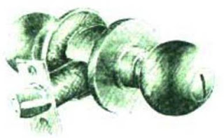

16. Tone / line value combined

Combining tone and line value drawings

offers the greatest flexibility

and is preferred by many professionals.

It incorporates the best qualities of each

and can be used with variety of techniques.
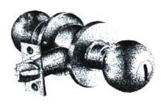

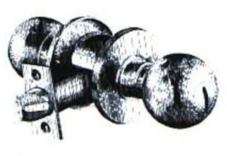
17. Pointillism

Pointillism, or “stippling”,

means rendering value changes with dots.

This technique though somewhat time consuming,

can give the drawing a very soft

and refined appearance.

It is most appropriate for black and white reproduction,

although by using coloured inks or pens

a coloured drawing can be produced.

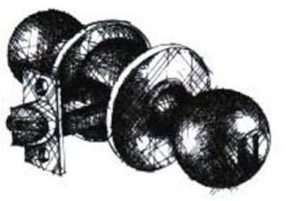
18. Vertical / Horizontal line

Vertical and horizontal line technique

create form and value with parallel lines.

As in pointillism,

shapes are identified through value changes

rather than outline.

Both vertical and horizontal line techniques,

which use pen and ink most often,

are very time consuming,

but allow for interesting results,

particularly when viewed from a distance.

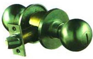
19. Cross hatching

Cross hatching uses crossed lines

to identify value changes and forms.

Pencil or pen and ink are the most appropriate mediums.

While cross hatching is extremely time consuming,

it can result in a superb final presentation drawing.

20. Computer application

Computer graphics has become very popular in recent years.

Although it takes time to master,

the results can be very impressive.

Computer application in graphics

has both advantages and disadvantages.

The advantages include allowing artists

to manipulate their work without fear of ruining the original,

to print graphics with smooth, crisp lines and edges,

and to experiment with colour quickly and easily.

Computer aided design programs

allow one to view the space in three dimensions

and to see the design in a walk-through

sequence of the spaces.

Once all possible views are examined,

one may choose the angle most suitable

to the final rendering.

The disadvantage of the computer is that

the artist is almost automatically

out into the left-side mode of the brain,

and working on two-dimensional computer screen

can inhibit creativity

and the looseness needed for impulsive,

imaginative renderings.

However, the computer is an important and useful tool,

especially for some of the time consuming tasks.

Its use should be combined with

personal creativity and application

of the design principles.


-------------------------------------------------------

So as for practice
we were told to draw two stones
by using rendering techniques
that we learned.
Somehow I can't show it here
because my scanner
is still not functioning.
When I showed the drawing
to my lecturer, he told me
"you need to work on your contrast"
I was like "Huh? Why?"
and he said "because it looks flat"
hahahahahahhahaha XD

Then I edited the drawing a little bit
to give it it's shape and showed it again.
This time he said "Yes! But it still need some contrast"
I was like "Oh yeah~"
hahahahahahha

So as for our assignment
we had to draw 2 stones again
but on an A2 cartridge paper
which is like damn big!
I just finished the scaling
and rough picture of it.
Hopefully I can finish with
the hatching and contrast on time
(@_@)

Thank You For The Visit!
*bows*